Kick-off assignment
Mapping the user
Mapping the collection
105 Interfaces Colection
Aimeric
Karya
Display typefaces:
Secondary typefaces:
THE MAIN CONCEPT:
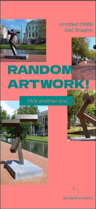
An app/site that randomizes a random artwork from a pre-selection of the BKOR Collection. From this random artwork, the users create their own outfit for their night out or at a party. Its main use is for a group of people. For a group of party people it could be used before the event to establish a dress code and could be used for costume parties. Its main purpose is as a tool to enhance the party experience. To make people express themselves truly via the way they dress and to create interaction with different individuals.
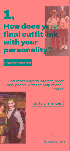
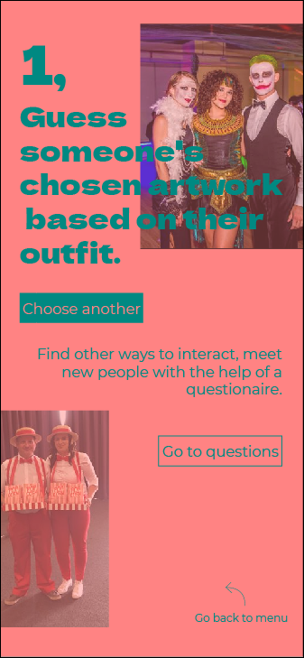
ONCE THEY ARE DRESSED UP THE APP/SITE COULD PROPOSE CHALLENGES TO DO TO CREATE INTERACTION AND START CONVERSATIONS:
Compliment someone's artwork.
Guess someone's chosen artwork based on their outfit.
Make people guess what your initial artwork was.
Find someone who's artwork struck you the most and tell them why.
Find someone with a similar outfit as yours and see if you have the same first artwork
I imagine having something quite festive and bold without being too much over the top. As if it looks too much playful it can be seen as very childish, child-friendly
UX TESTING PLAN
- What are you going to test? Which prototype are you making?
A Figma, UI Prototype that is still not implemented in a website form.
- Where will you test?
- Who will be your testers?
Party people, people that have experience with parties.
- How will you document your test?
Photos of the outfits, answered questionnaires.
A concern I might have is that I must have something that generates an artwork from the BKOR Collection or from a pre-selection and I need it to be random. Figma or other ui softwares might not be able to provide prototypes of this type and therefore it might already need to be in almost final or final form (coded website or app).
Another concern I might have is that testing could need the presence of actual parties for an optimal testing and due to the corona outbreak it might be slightly harder to do that.
Tasks to do:
1. Choose a difficulty (Easy, Hard, Medium)
2. Chose the artwork that has been generated for you if you like it or have some link with it
Otherwise, generate another artwork.
3. Create an outfit out that could correspond to the chosen artwork
4. Choose to try to do some challenges proposed from the site.
Questions after testing:
How did you find the experience?
Was the concept of the app clear for you straight of the bat on the menu?
Was the possibility to choose between 3 artworks, is there the need to add more choice?
Did the app help create interaction, start conversations?
With the bias of this interaction were you able to express yourself like you wanted, were you restricted in some way?
Did the app motivate you to go out of your comfort zone?
Is there any questions or challenges you could add to the mix?


WASSIM:
How did you find the experience?
I really liked the interface, the multiple colors implemented, it did retranscribe a bit of a party atmosphere/mood.
Was the concept of the app clear for you straight of the bat on the menu?
Yes but maybe since you explained me beforehand.
Were you able to find an artwork that suited you, having only the possibility to have 3 tries?
I think 3 artworks is enough to choose from.
Did the app help create interaction, start conversations?
Challenges stayed simple so I am guessing it could help for meeting people. Plus if everyone uses this interface at the same time you won't have the thought that you are doing something wrong. It could help boost confidence.
With the help of this interaction were you able to express yourself like you wanted, were you restricted in some way?
I was not restricted at all.
Did the app motivate you to go out of your comfort zone?
Is there any questions or challenges you could add to the mix?
Additional notes: There is a lot of text to work with in the first page.
GUILLAUME:
How did you find the experience?
Was the concept of the app clear for you right of the bat on the menu?
The text on the first page seemed a bit long at first, but it was okay.
Were you able to find an artwork that suited you, with only 3 artworks to choose from?
Yes, no problems what so ever.
Did the app help create interaction, start conversations?
It probably can go in that direction, yes.
With the help of this interaction were you able to express yourself like you wanted, were you restricted in some way?
Yes, it is quite open for your interpretation so there is no sort of restriction.
Did the app motivate you to go out of your comfort zone?
Is there any questions or challenges you could add to the mix?
/
HAWA:
How did you find the experience?
Yes, no problems. I liked how the app is quite colorful. Im not sure if it is for everyone but it could be fun to try out at a party.
Was the concept of the app clear for you right of the bat on the menu?
The idea was really broad to me at first.
Was the possibility to choose between 3 artworks, is there the need to add more choice?
Did the app help create interaction, start conversations?
Im guessing it can, but you have to all agree on using this app as a group. You can't be the only one using it.
With the help of this interaction were you able to express yourself like you wanted, were you restricted in some way?
I think it is a great way to find a theme for your outfit and could inspire some people.
Did the app motivate you to go out of your comfort zone?
It did motivate me to try new things in terms of what I wear.
Is there any questions or challenges you could add to the mix?
"Go talk to the stranger to your right... " (Something that adds some randomness in the challenges you do too).
Additional notes: Lack of pictures in the interface or maybe illustrations to help explain the concept.
FEEDBACK AND ADVICE FROM MARK AND ROGERIO:
The research made it did not lead to a characterisation beyond the visual markers yet. Move beyond what you now see as typical (energetic, dancing and love) and dive deeper to look for motivations (e.g. escapism).
However, it did not lead to a characterisation beyond the visual markersyet. Move beyond what you now see as typical (energetic, dancing and love) anddive deeper to look for motivations (e.g. escapism).
POST FEEBACK RESEARCH:
Why do people go to parties?
- To escape reality, avoid their everyday troubles/problems.
Whether it is to get rid of monotonous daily life, fear or thoughts, this is the perfect platform to distract people from the lights to the handsome guy or chick next to the bar. After every meeting, there will always be a new story to tell. It can be something you are proud of, or something you deeply regret. However, no matter how ecstatic the moment is, you must admit that it can only be sustained. As mentioned earlier, this is an escape-you cannot escape forever.
- To meet people, find a significant other.
Parties are a place where you meet people who are likely there to meet other people as well, probably not for the same reasons, but at a basic level.
- To express themselves (dancing, singing, clothing, other activities)
It’s a time where expression is free and fear is diminished.
- To celebrate
- To go out and enjoy their time with friends. Simply because they see it as having fun.
- Peer pressure. Not the main reason people go to parties but could have its effect.
USER TESTING
INITIAL SKETCHES OF CHOSEN CONCEPT
INITIAL 10 SKETCHES
MOODBOARD AND INSPIRATIONS
Click here to access FigJam board.
FIRST DESIGN OF PROTOTYPE
SUMMARY OF USER TESTING AND TUTOR FEEDBACK (KIMMY):
- Illustrations/Photos could be added
- The "How it works" section has too much text and can see intimidating.
- The fact that this site is used in a party setting needs to be explained.
- The font used in titles can still be changed for something a bit more playful/fun.
CAIRO
BASTELEUR
USER EXPERIENCE FEEDBACK (ARJEN):
- Check button on the right, reject button on the left
- A reload icon might be more suitable for the reject button
- Could add a social aspect to the site/app, (make users publish the outfits they created)
MODAK
ESTABLISHING THE COLLECTION
The collection the user has access to depends on the level of difficulty he firstly chose. I pre-selected a group of 10 artworks for each difficulty. This pre-selection was made based on the research gathered in mapping the collection. They all have some link with the user, from it's theme to its aesthetic.
The excel sheets listed below also served as data files for the site of this interface.
FEEDBACK FROM RESEARCH TUTORS
FEEDBACK FROM MEGAN:
- There needs something that stimulates the user to interact with this app/site. Something that rewards them in the end.
- Could add a social aspect to the site/app, (make users publish the outfits they created)
- The typography used could seem playful and fun, not only by how it looks and what it is normally assimilated to but also by how it is placed. Some letters could be misplaced, the size could vary...
ERICA ONE paired with ROBOTO
USER TESTING PLAN
INITIAL TYPOGRAPHY IDEAS
FINAL FEEDBACK
I chose to go with Erica One & Roboto as it has this playful and fun feel around it without being too much child-friendly. It still holds a bit of seriousness around it and the very bold are more eye-catching.
COLLECTION FOR EASY MODE:
Artworks for which the meaning of the artwork was easily given and or for which it was easy to get inspired from it colors, aesthetic, theme, atmosphere.
COLLECTION FOR MEDIUM MODE:
Artworks for which it demands a bit more reflection and the meaning of the artwork does not come up straight away.
COLLECTION FOR HARD MODE:
Artworks for which the theme/meaning was quite hard to depict and or that could demand access to different tools and materials. Might not demand a piece of clothing that you can directly take out from your closet. It is more intended for outfits that are to be made from scratch (DIY).
USER FLOWCHART OF THE APP/SITE. It was tweaked and changed progressively overtime as I added some functionalities.
FINAL DESIGN OF THE INTERFACE
Click here to access Figma file
Click here to access Figma prototype
Click here to access "Hard" excel sheet
Click here to access "Medium" excel sheet
Click here to access "Easy" excel sheet
SITE CODED HTML/CSS/JS
The site dedicated to this interface is partially coded, in which you can see the generator in action (something you cannot do with a Figma prototype as everything is pre-determined)
Click here to access the site
INTERACTION STATION DELIVERABLE
First sketch of the main page.
First sketch of a challenge page.
First sketch of a question page. I chose not to include questions in the end.
In response to the feedback I got:
- I chose to add illustrations in the "How it works" section for a more pleasant experience and easier reading
- I chose to change the buttons and how they were placed when accept or refusing an artwork
- I chose to reorder the main page so that it gives access to the other main pages.
- I chose to add a help icon at the top, so that the "How it works" section is easily accessible from every page.
For example if the user dances with a lot of energy, quickly and has a fast pace. The interface could link him with an artwork that is energetic, that involves or show motion. If the user's manner of dancing is quite odd or uncommon it could link him with an artwork that is more spontaneous, random, abstract.